flora moon
Brand Identity
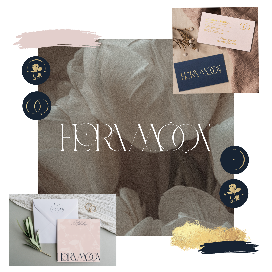
Flora Moon Events is a day-of wedding planning studio known for crafting effortless, romantic celebrations. Their original logo captured a glimpse of their essence, but the overall brand lacked the refinement and cohesion needed to attract a higher-end clientele.
The goal of this rebrand was to elevate and modernize the identity, creating a look that reflects the sophistication and creative artistry behind every Flora Moon event.
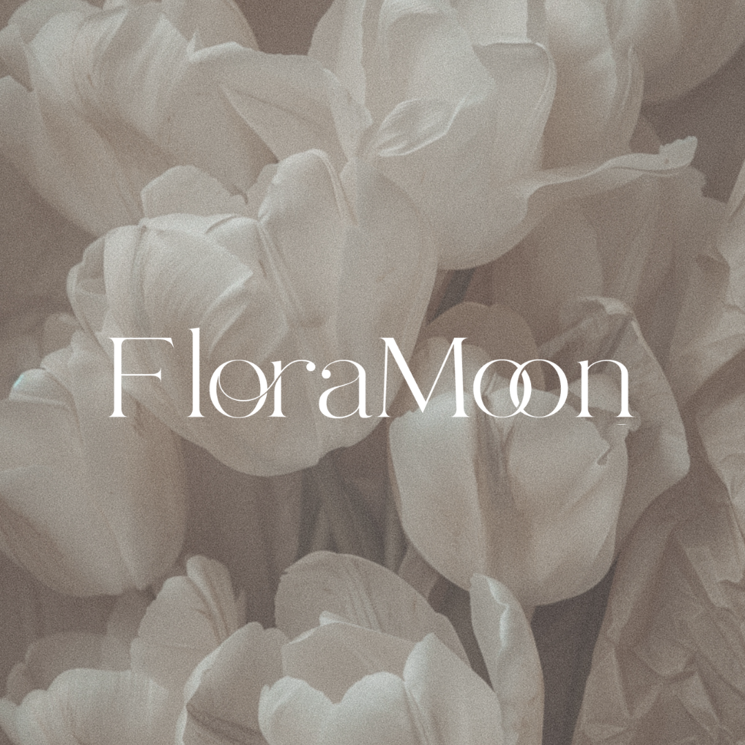
I enhanced the existing logo concept (above) by upgrading to a more elegant and timeless font and then building a full brand system around it: a romantic yet modern color palette, timeless typography, and flexible design elements that feel elegant across every touchpoint. The pairing of Blosta, a classic serif, with Montserrat’s contemporary lines strikes the perfect balance between tradition and modernity.
Clean iconography and a thoughtfully curated color variations brings versatility to the brand, ensuring it translates seamlessly from printed stationery to digital platforms.
The result is a beautifully cohesive identity that feels aligned with Flora Moon’s luxury clientele. The refreshed design not only enhances brand recognition but also communicates trust, creativity, and timeless elegance, a true reflection of the unforgettable events Flora Moon creates.